Box Art Disparity: Sega CD / Mega CD Across the Regions
|
8 December 2009
Ten examples seems far too few for an objective study, especially this time. This regional contest is remarkably close. Indeed, there are even some cases where no country emerges as the obvious winner. When U.S. artwork wins, it's merely by a nose—never a blowout. The the European art is at the other end of the spectum—always decent, if not excellent, but never the ultimate loser. Japan finds itself somewhere in the awkward middle; while rarely the loser, it sometimes simply isn't as good as the alternative.
That said, the bottom line is there's a lot of diversity here. Whether you're trying to send a simple message to your audience—like the game's title—or present a more complex story with your box art—such as the plot, the characters, and/or the conflict—you'll find it in varying degrees of presentation and completeness below. While artistic skill may vary, I can promise you that in keeping with the standard of this site all of these games are worth your play time. Enjoy! |
|
|
|
|
 |
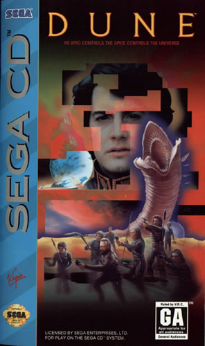
| Apparently, Sega was so intrigued with the red Genesis stripe that plagued U.S. box art for carts, they saw fit to apply a blue Sega CD stripe in similar fashion.
Moving right along, I like that with the US art there's an attempt to show a conflict and convey the story line of the game. We see Paul, a Giant Worm, and the Fremen. Pretty cool. But what the hell is with this pixilated, chunky visual style? It doesn't look dreamlike? It doesn't smooth the transition between the different sections of the composition. Rather, it makes the presentation ugly—not in a cool atari retro way.
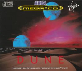
Thought the European artwork is less ambitious, its elegance more than compensates. The two moons immediately evoke the sci-fi setting. Moreover, the sand dunes—such a crucial and iconic element of the Dune books—are presented much more effectively and beautifully. The dunes rolling into the distance even allude to the large scope of the adventure. Finally, the red sky is obviously a bad omen, a portent for the conflict that drives the plot. |
|
|
|
|
|
 |
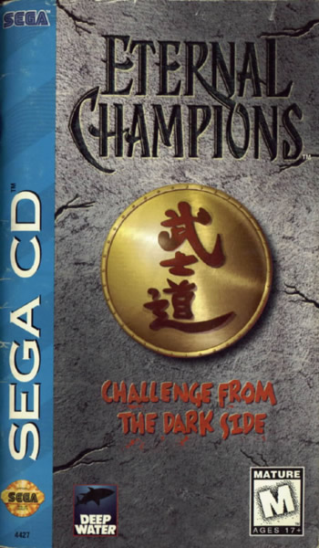
| This time, we're faced the choice between the lesser of evils. Each piece of artwork takes a very different approach, but both suffer from fundamental flaws in composition and execution.
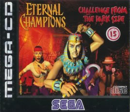
On the American side of the spectrum, we have iconic simplicity, little more than words on a wall. The cracks in the wall suggest that there's some history behind the story—a nice touch—but they also look horribly fake and unrealistic. Looking at the composition in general, we have a bold black title, Chinese characters, and blood red sub-title—in other words: BORING! Even a person with no artistic background could have created something more original.
In Europe, photorealism, (or should I say fauxtorealism?) goes awry. All three characters look incredibly goofy. Ramses III is a stereotypical
caricature
of an Egyptian ruler. Riptide is bursting out of her costume and has a bizarre open-mouthed expression—I dare not speculate. Finally, there's Larcen who looks chunky rather than stealthy.
|
|
|
|
|
 |
 |
|
 |
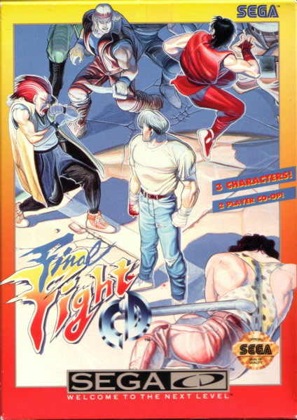
Alright! For once the U.S. cover art is actually quite good! Cody and Guy are obviously present, but where's Haggar? You must highlight all three players, given that the SNES ports of Final Fight found it impossible to include all three. There's a nice blend of action, from the serene Cody in the center to the fallen Andore and the lurking enemies in the upper left corner. The fire colors around the border of the box contrast nicely with the blue shadows dominating the main picture—a very solid composition, overall, and a fine example using a wide range of colors to great effect.
The European art manages to include Haggar but basically gives up on everything else. Gone is any real sense of action—no enemies, and nothing else significant, in general. What we have here...is failure to communicate, some men...Ahem, what I'm trying to say is: this composition = lazy. Three main characters, the title, brick, and white space. Hard to imagine something less ambitious.
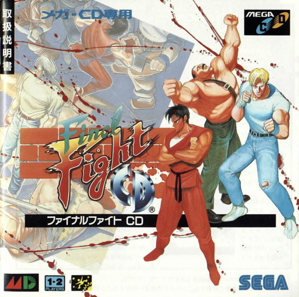
Interestingly, the Japanese artwork is basically a blend of the U.S. and European approaches. All three characters are poised for action. But in the faded action scene to the left Cody and Guy are mixing it up with thugs. The angle of the faded action scene as well as the lines of blood represent an impressive transition between the two panes of the story. While the U.S. artwork is good, you have to be impressed by how the Japanese version manages to accomplish more, despite its smaller canvas. |
|
|
|
|
 |
 |
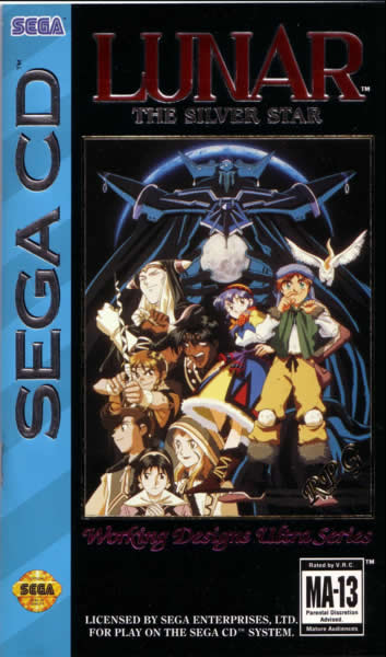
| The U.S. version takes the ensemble approach, presenting all the main characters, and—amazingly enough!—uses the animé art style. The black background ties the characters, villain, and title together quite well. However, it is a little odd that Alex appears to be floating.
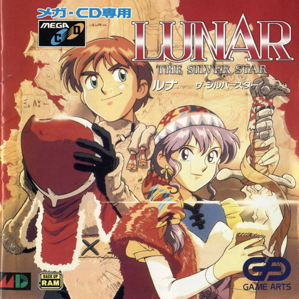
You find a much more focused composition in Japan—Just Alex and Luna. This time, red, rather than black, is the overall color. The map in the background gives a sense for the journey. Oddly, Alex and Luna seem to have had a role reversal. Why is Luna holding the sword while Alex has a fuzzy hat in his arms?
Choosing a favorite is a tough call. While I like the cleaner look of the Japanese version, I must admit that the U.S. composition shows greater depth and is more compelling, highlighting the game's conflict. |
|
|
|
|
 |
 |
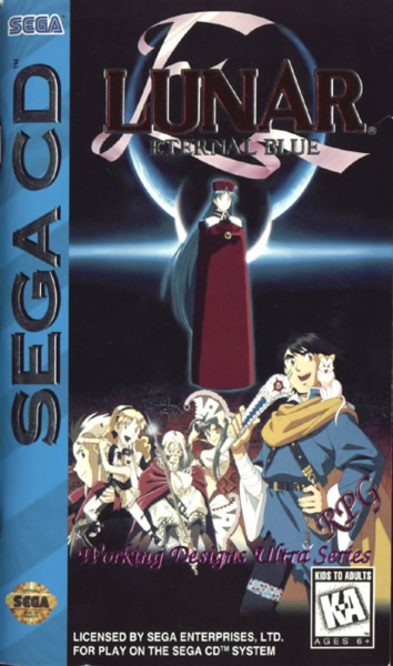
| Compared to Silver Star, this composition is more cluttered and less efficient. The main characters present a boring lineup that's confusing—far from dynamic. Above, Lucia takes up lots of space but is nowhere near as menacing as Ghaleon in the original.
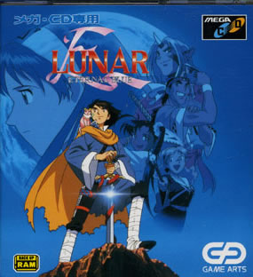
Immediately, the Japanese artwork demonstrates greater imagination. Hiro is naturally at the center, but Lucia and the other characters radiate out of him, appearing like a memory or dream. The triangular structure and gives the composition a much more dynamic nature. Having Lucia's profile blend into the curvature of the moon is also very effective—both artistically and in terms of telling the story.
Whereas last time the U.S. artwork trimuphed, this time the Japanese wins. |
|
|
|
|
|
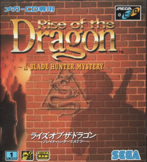 |
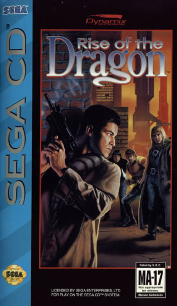
The American art tells a clear story. Obviously, the man adorned in the trench coat in the foreground must be a detective, and he's trying to solve a mystery that puts his life at stake. Crisp colors and attention to shadows make for a fine presentation, while the strange gun and buildings in the background allude to the title's cyber-punk setting.
The Japanese composition goes in an unusually minimalist direction, shuning sci-fi imagery in favor of a more occult and fantastic approach, given the hooded figures, the fiery lighting around them, and the central sigil of a snake. Overall, one cannot help but be underwhelmed by the lack of any real effort to reveal what the game is really about. The artwork should better support the assertion that this is a "Blade Hunter Mystery." |
|
|
|
|
 |
 |
|
 |
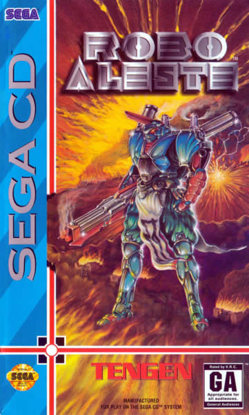
Ultimately, the U.S. artwork presents only two things: a figure and a background. Granted, both are done fairly well. The gun-toting warrior looks formidable, sporting details like the smoking gun and light reflecting off the armor. But I have to wonder how many people would pick up on the subtle references to samurai. I imagine that most newcomers wouldn't appreciate the tabard hanging off this mech's waist or the head protection that resembles feudal helmets.
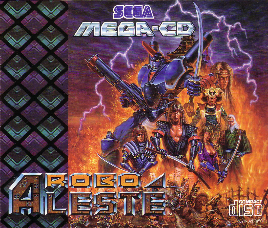
In Europe we find a different piece of art, based on the Japanese version. In the Europe vs. Japan sense, we're really only talking about a difference in cropping of the art and lettering. Don't ask me why the Europeans were "treated" to a blocky box stripe of their own this time—at least it consists of a
tessellation, rather than the solid colors that plague U.S Sega Genesis and Sega CD releases. Nevertheless, this diamond
tessellation
background poses a fundamental problem: it restricts the canvas, limiting space the real art.
Now let's focus on the actual art seen in the European and Japanese releases. Our robot hero looks similar with one notable exception: it's wielding a katana. Ding, ding, ding! Already an extra point for more clearly conveying the game's feudal Japan focus rather than a purely sci-fi one. The surrounding swordsmen and traditional figures make this setting more obvious. Even the background is better than its U.S. cunterpart, which basically wasted the additional vertical space offered by the canvas. The fire and lava effects are much more convincing, plus you've got lightning forking through the sky, and a feudal Japanese building looming over it all as well. A smaller piece of work yes, yet it provides much more information and more effectively establishes the game's setting. |
|
|
|
|
 |
 |
|
 |
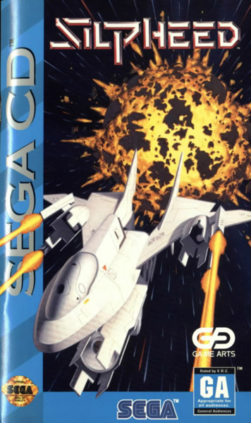
Having an action-packed game cover is great, and at least in this example it does an exemplary job of showing off the genre. I'll even give some credit to the U.S. arabesque composition, where the spaceship is literally bursting out of the confines of the portrait—or, better yet, shooting the ugly Sega CD stripe. That the explosion behind this heavily-armed ship looks overly symmetric and generally lame is a rather—ahem—incendiary disappointment. While Silpheed does have its gameplay issues, at a minimum the visuals are brilliant, yet this box cover does little to demonstrate just that.
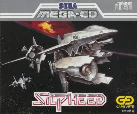
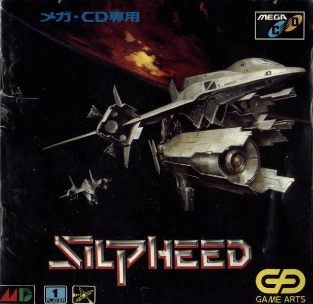
The European and Japanese art are basically identical—might as well cover them both at once, rather than mince words on silly things like lettering. Technically, the action is non-existent this time around, yet look how much stronger the composition is, overall. Feel the ambiance: the ominous red planet in the distance, its unusually yellow spot, possibly an explosion. The ship—your ship—is also much more detailed. You can practically see each metallic panel on the hull. While there are not any explosions, it's obvious that his is a shoot 'em up game. |
|
|
|
|
 |
 |
|
 |
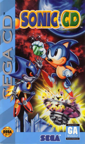
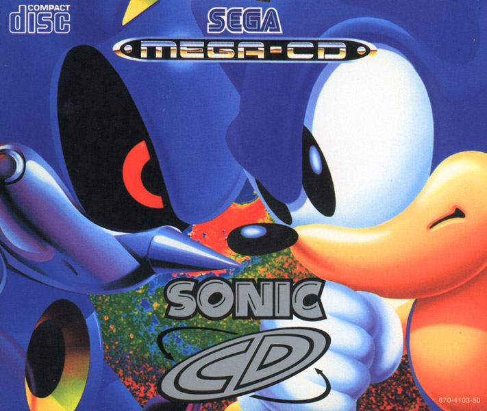
The U.S. composition may be dedicated to telling a story—yes—but artistic or interesting at all?—not really. We see a smiling Sonic, a robot duplicate of Sonic impotently reaching upwards, trying to grab what I presume is a chaos emerald. At the same time, a Dr. Robotnik-created module is exploding below, near some crystalline structures that could be left over props from any Hollywood film. Give me a D! U! L! L! And this is Sega's flagship character? Comparatively, Europe has much less canvas space and it work with and it wastes little. The Sonic vs. robot conflict is distilled down to it's simplest features, literally a head-to-head conflict between the two of them. The robot's red eye looks much more menacing up close, and Sonic's eyes and mouth show his struggle rather than silly confidence. The color choices of two very similar blues for the robot and Sonic are also inspired, suggesting that hedgehog and robot resemble each other to an uncomfortably close degree.
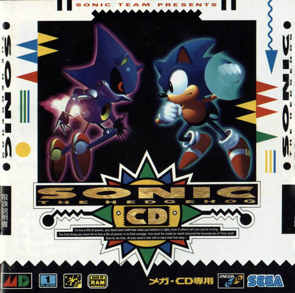
With the European composition in mind, everything that's wrong with this Japanese one becomes evident immediately. The physical separation between Sonic and the robot only makes the conflict more abstract. Not to mention how silly Sonic's looks with his fist encased in that—what is it?—crescent-shaped speed-punching blur? All of these comments are, of course, assuming that you can even focus on the central piece of art and ignore the extremely distracting background. With the onslaught of rainbow colors, contrasted in both white and black, this is an evil Rastafarian nightmare. |
|
|
|
|
|
 |
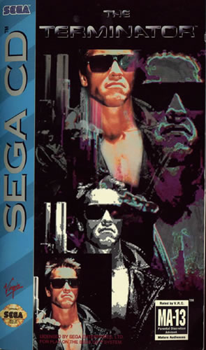
It all comes full circle. We began with Dune box art that was highly pixilated—to its detriment. Here we finish with U.S. box art depicting one of the most vicious robots ever seen on film. He's so terrible that he appears four different times—none of them very convincing!
Once again, the European composition copes with a much smaller canvas. It only shows one picture of Arnold, yet this one image is much more convincing and impressive than the four-fold Arnold approach taken by its U.S. counterpart. The leather jacket is blacker, the radiating red lines are violent, his synthetic flesh looks more convincing, and the red reflection in his sunglasses is a brilliant detail. Keeping it simple really works here. There are many Arnolds here, but clearly the European one is the truest. |
|
|
|