Box Art Disparity: The Story of American
Box Art Actually Improving...A Little
|
11 October 2010
You probably recall the ridiculous blowout when I pitted Japan vs. the U.S. for HuCard games. Now we turn our attention to the optical format, and once again it's hard to argue that U.S. box art has any sort of edge over the competition. At least, however, it's a closer race. No American examples below approach the levels of putrescence seen during the previous TurboGrafx-16 box art comparison.
Nevertheless, it's surprising how people responsible for marketing in the U.S. can take a perfectly good piece of Japanese art work and "adapt" it in a way that makes it strictly harder on the eyes than the original. Most shocking of all, though, is the fact that there might even be a box or two below that's better than it's Japanese counterpart. Will wonders never cease? |
|
|
|
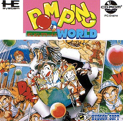
This composition is an excellent example of what happens when the individual parts fail to form a coherent whole. The title looks clumsy with the white space on either side, and the actual art composition below seems equally disconnected. The bottom piece is excessively busy, but it does convey a light-hearted tone, and gives you plenty to think about and digest. It's a shame that the clumsiness of the composition makes it difficult to appreciate the detailed art work. |
|
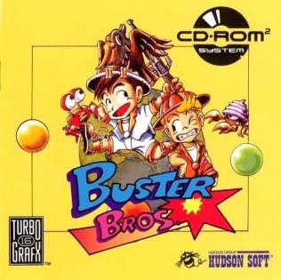
The U.S. box art isolates the central image from the Japanese version, and the title is incorporated seamlessly as well. Beyond that, everything goes horribly wrong. Of all the colors to choose for a background that squanders over half the canvas, why choose that mustard yellow? Did you really need to make the CD-ROM logo bigger? While the Japanese version has significant problems, at least the puke-like yellow color doesn't make you sick. |
|
|
|
 |
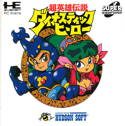
The space background establishes the science-fiction setting nicely. Yeah, we're clearly in Japanese animé land here; every character has an open-mouthed overly-animated expression. I guess they're all jumping out from what? A spaceship? This is a solid effort but it's by no means remarkable. It suffers from over-jumbliness similar to that of Pomping World. |
|
Apparently, Working Designs thought that Americans needed some more "realistic" characters. FAIL. Look how goofy that cat is, and the spaceship looks like an afterthought—a very fractured composition. The yellow label stripe at the top and congested only add to the fragmentation. |
|
|
|
|
Though this definitely has a hentai sort of feel to it, the composition is actually rather nice. The silhouetted circle behind Cotton really helps pull the composition together. Contrast between the gray background and the pinks and purples also works quite well. Using the diaphanous wings to avoid obscuring the Super CD-ROM logo is also clever. If only the American version was so adept at dealing with logos. |
|
At first glance this looks pretty similar, yet each little change hurts. The black background appears lazy and does nothing help the overall composition. I like the idea of including the broom, but the title's position makes it hard to recognize the witch's flying device. It's also unfortunate that the Super-CD logo is even bigger, colliding with Cotton's head and the T-T-i logo isn't a welcome addition either. |
|
|
|
|
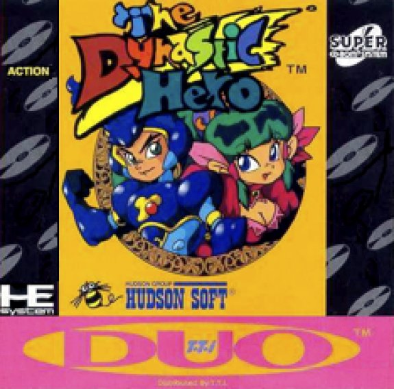
There's quite a bit of unused white space here, but at least it provides a hell of a contrast. Throw in some animé cuteness, the obligatory green hair, and what the hell is that coming out of the hero's head? Wow that's quite strange. A third arm? WTF? Overall, I'd call this mediocre but passable. |
|
Why seattle for mediocre, though, when you can easily make a box look terrible? From the mustard yellow background, to the pink Duo lettering and the floating CDs in the background, this box is a perfect example of how much can go wrong with colors and contrast. At least the title obscures the strange head growth. |
|
|
|
|
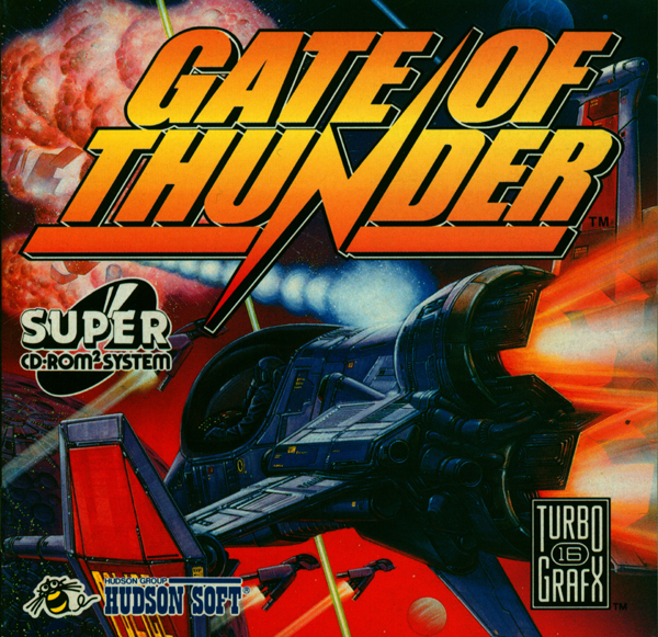
What a brilliant use of a limited color palette. Normally, all the gun turrets on this imposing space fighter could easily get overlooked, but not with this excellent contrast. While I would have liked to see some element of conflict or action, you do immediately know that what you're looking at is a shoot 'em up, and a beautiful one at that. |
|
This has potential, but the perspective and placement of the title cause some major problems. Why is the focus on the rear of the spaceship and its thrusters, while the enemy you're shooting at is totally obscured by lettering? Did the artist lack confidence in his ability to depict an exploding ship? Or maybe the person in charge of the lettering had an axe to grind with the artist? |
|
|
|
|
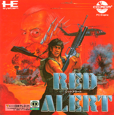
Rambo comes to mind instantly, except this guy looks much cooler, sporting more of an animé haircut, and against an impossibly red background. Surely, the sinister, monocle-wearing old man with the metal claw is the villain. It's a little annoying the the game's title obscures the tank behind our hero, but otherwise this is a very good piece of art, and it's hard to imagine a better composition for a run 'n gun game. |
|
Apparently this is a game where you trudge through sewers while stalactites shoot very poorly aimed laser beams at you. Gone is the complexity from the Japanese version. The details suffer as well—look at those fluffly air-brushed muscles. The gun looks fake, too. The artist went the extra distance, though, and even provided a cheesy mop haircut. FAIL. |
|
|
|
|
The art within the small central box is quite beautiful. Too bad there's that pink word bubble and the rather dull snowflake border taking up so much box space. Seems like the title, format, console, and game credits take up an unnecessary amount of space as well. Nevertheless, if you focus on the central art, you have to be impressed. Note the menacing visage that lurks in the dark clouds—a very nice touch. |
|
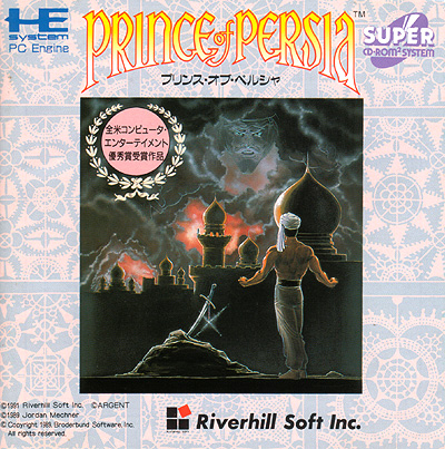
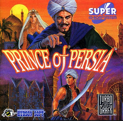
Where the Japanese version struggled to fill the canvas, the U.S. art work does a marvelous job of presenting the characters, the title, and even telling a story. The evil vizier stands between the princess and our princely hero. Look how he points and the dagger of the "of" points down at said prince. The two characters up top are a little over-the-top in expressiveness, but the composition as a whole hangs together very well. |
|
|
|
|
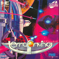
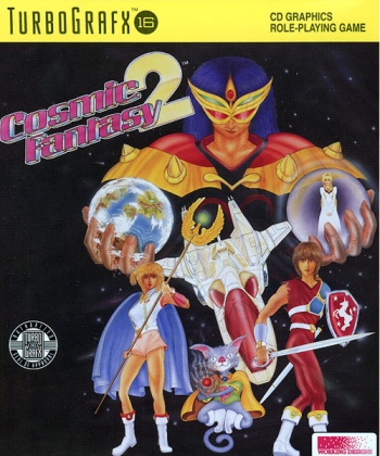
The circular and spherical style of these ships is very 2001 Space Odyssey. Pinks, purples, and blues dominate the composition, and the orange planet in the background provides a nice sense of scale, as well as homage to the planet-clutching "f" in the title. A gorgeous box, overall, and I wish I had a higher resolution scan. |
|
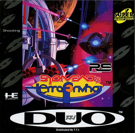
TTI was supposed to rescue the Turbo Duo from ignominious defeat in the United States, not modify boxes so that they look worse than the originals. Not only do you contend with a useless, crappy black border, but there's even a yellow Super CD logo! The addition of futurist Syd Mead's name to the title is fine, but was gooey mustard yellow necessary to connect it? |
|
|
|
|
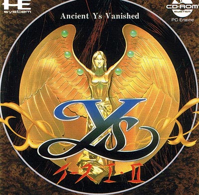
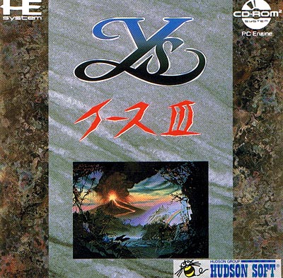
This is stunning. The statue of this goddess dominates the box, and it's hard to take your eyes off her. When you do, the other details emerge, like the bridge through the dark cavern behind her, the crystals on her wings. You have to give the lettering guy credit, too, because the Ys part of the title text looks gorgeous with it's dark blue fade. |
|
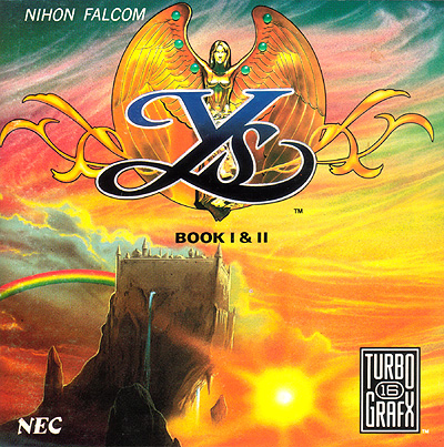
For once you get more than the original Japanese box art. The gorgeous icon from the original now serves merely as the title, while there's a fabulous vista below. The castle on the mountain clearly evokes the fantasy genre, and the skyline is fantastic. This is among the best box art examples I've ever seen outside Japan. |
|
|
|
|
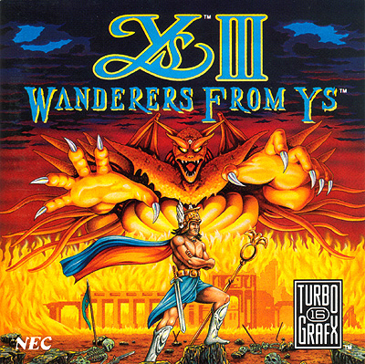
Unlike the previous title, this one takes the box art in a very earthy direction, from the marble-like background to the small landscape embedded at the bottom. While you have to give it credit for originality, the overall composition suffers somewhat with the thick gray stripe that takes up so much space. I also have to grip about box art that tells you nothing about the actual game. |
|
And now for something completely different! It's great to see the whole canvas used, and the selection of colors works out well, too. Something isn't quite right; notice all the flames are at the same height, and the horizon is perfectly flat as well. Everything is also a little overly symmetrical, adding to the feeling of flatness. This is a respectable effort, yet it ends up average, overall. |
|
|
|