27 May 2012
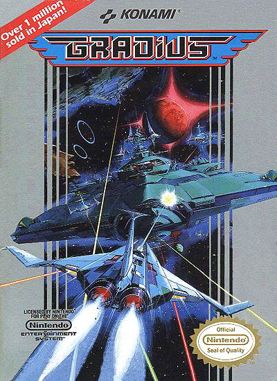
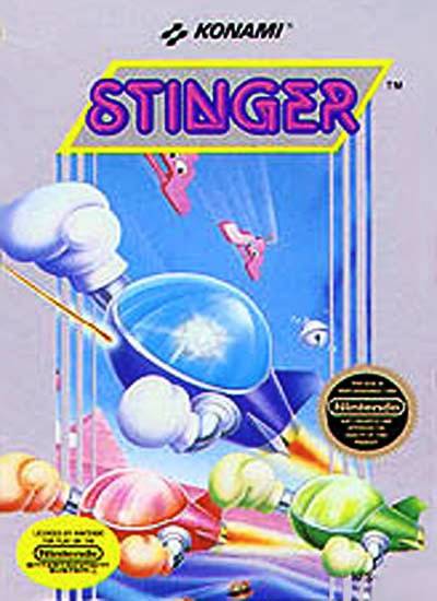
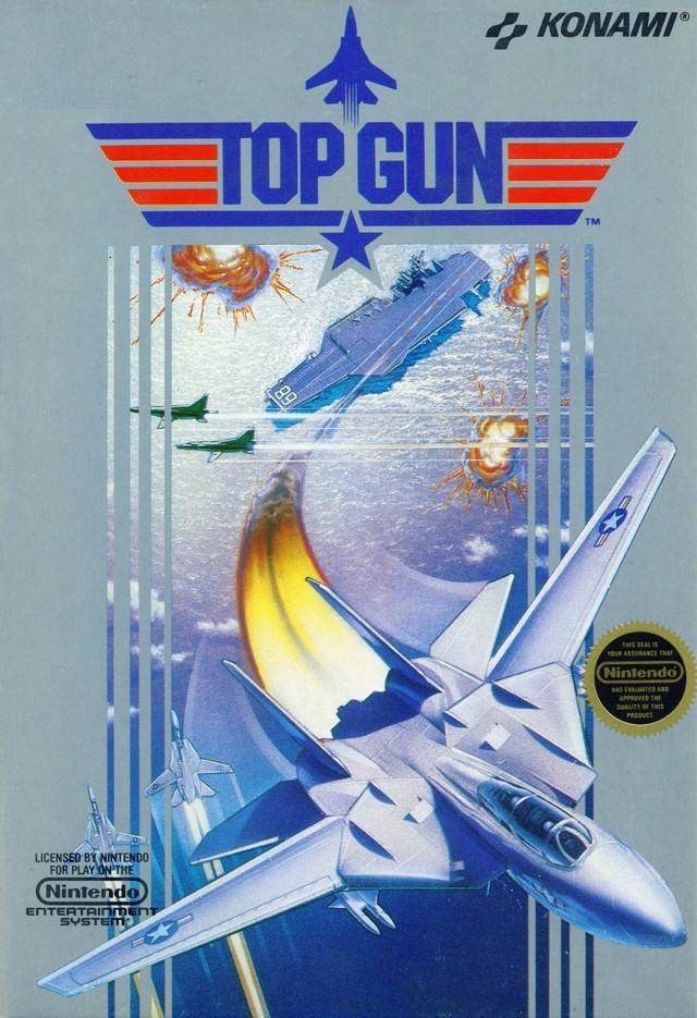
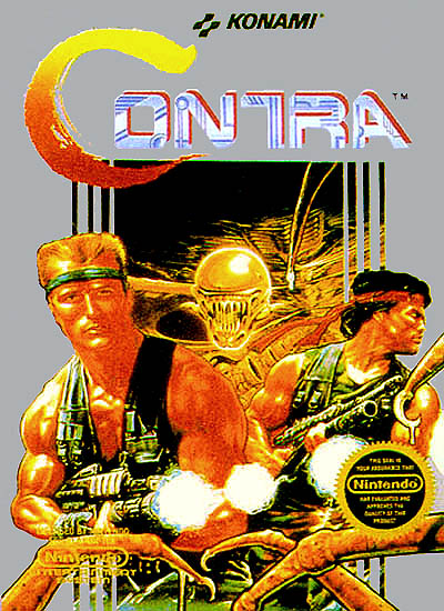
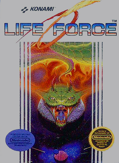
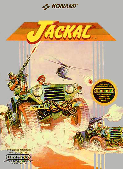
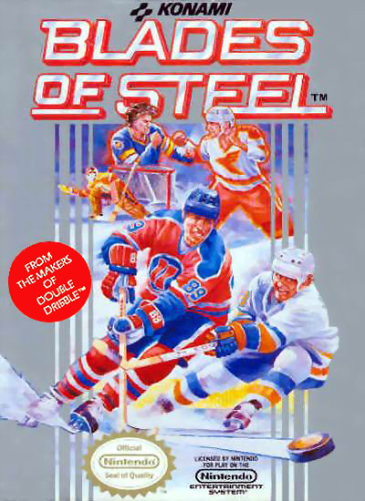
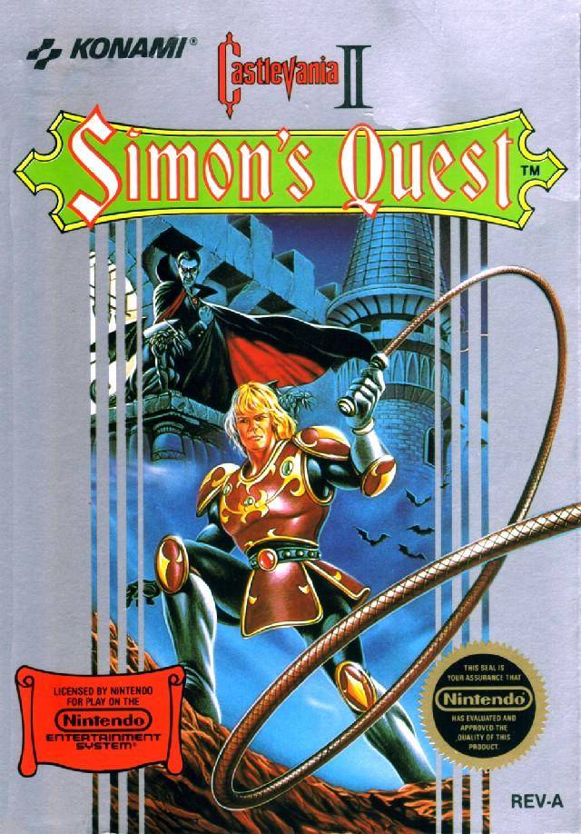
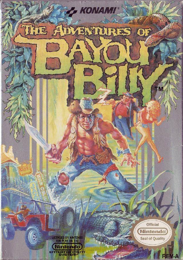
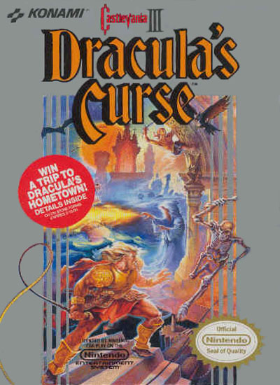
The marketing department for Konami established a very clear, consistent presentation for how their NES game boxes should look in the United States. For five years there was virtually no deviation. Every single Konami release featured the familiar silver/grey background and vertical interwoven vertical strips, alternating between slices of the central art and the border, to help make a transition that was pleasing to the eye. It may not have been beautiful, but the standardized approach did have its advantages. Thanks to some spectacular early releases like
Gradius,
Castlevania, and
Goonies II, people had very good reasons to distringuish Konami boxes from those of their competitors—all the easier with Konami's distinctive packaging. Remember, this was before the days of text messaging and Internet reviews. Boxes and packaging carried significance that seems totally foreign today.
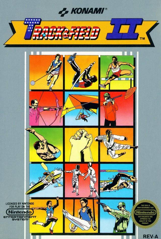
With 1989's Track and Field II release, the first abberation appeared, foreshadowing more drastic changes on the horizon. You'll find the familiar silver/grey background color. The box art in the center of this title is very geometric, yet you won't find the dinstinctive pillar-like transition between the central box art and the periphery.
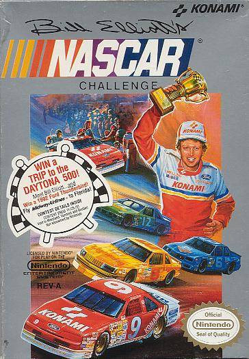
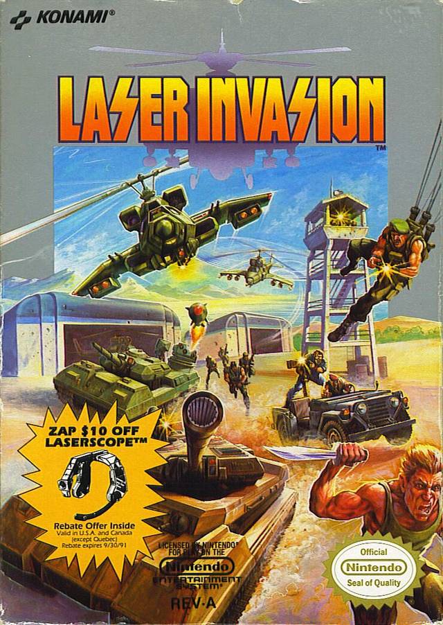
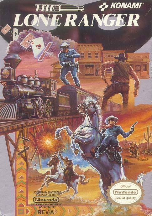
During 1990, Konami's American releases returned to their normal form, but only a year later the paradigm made a more permanent change. Though Bill Elliott's NASCAR challenge and Laser Invasion at least hewed to the all-too-familiar silver/grey border, The Lone Ranger barely bothered with a border at all, merely including six small polygons worth of what had become known as the Konami color. That same year, 1991, Konami games such as Tiny Toons Adventures and Contra Force abandoned the original box schematic entirely.
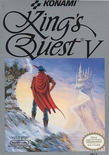
By the time 1992 rolled around, the iconic Konami box style was almost completely forgotten. However, Kings Quest V at least offered a parting homage with its background color.